Client
- Wifey with a Knifey
Sector
- Mobile food service, BC interior
Year
- 2022
Scope
- Brand identity, illustration, style guide, signage, packaging, merchandise
The problem
A new mobile food business launching into a crowded market. Working markets, fairs and local stops across the Okanagan and Kootenays, where the truck has to be recognised from across a field. Food trucks compete on visibility before anyone tastes the food.
The approach
The owner had the personality to be her own mascot, so I made her one. The name came from how she signed off lunch notes to her husband. It borders on sinister, which makes people look twice and then work out what the knife is actually for.
The system
Wifey with a Knifey
Process · Logo
One sketch became the submark and the main logo
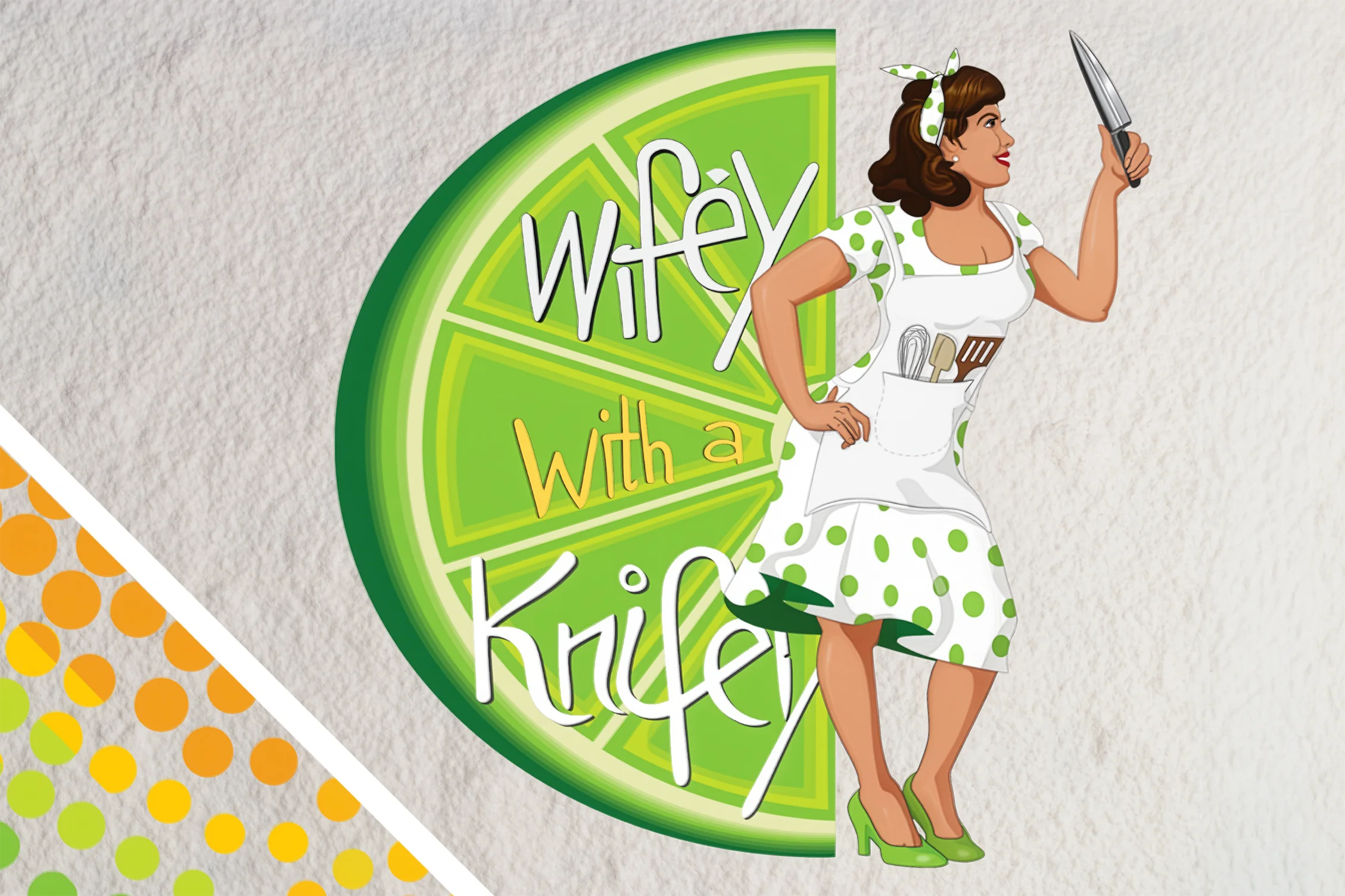
The primary mark. She steps out of the lime rather than sitting inside it. The lime's triangles point inward toward Wifey. The whole mark sits inside an implied circle.
01 Concept sketch
Knife slicing the lime, colours pulled from the menu
04 Ingredient palette
Lime, avocado, mango, cabbage, beans, sour cream
05 Main logo
The lime slice from the sketch, with Wifey as mascot
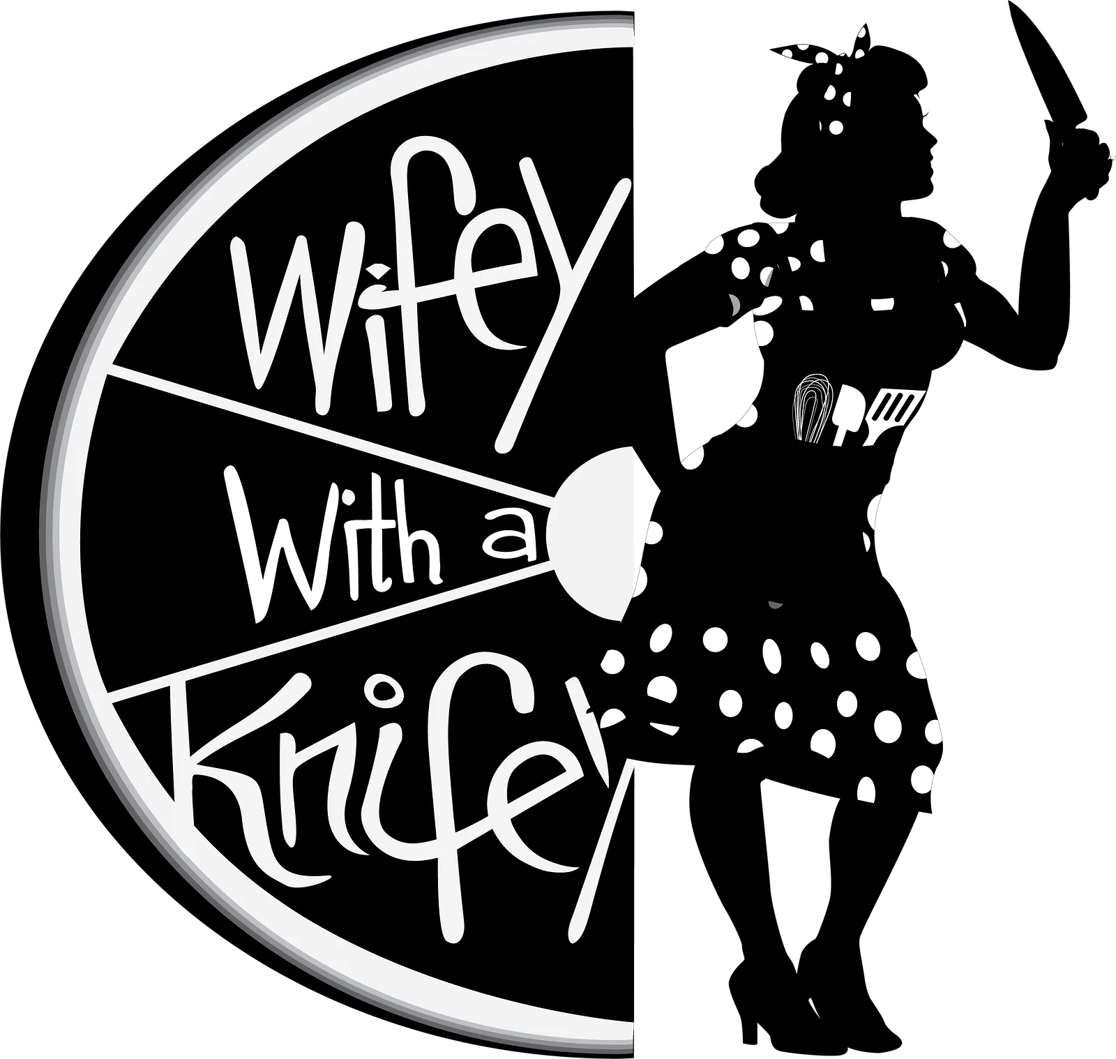
Submark for small sizes. Knife through the lettering, lipstick on the blade.
01 Concept sketch
Knife slicing the lime, colours pulled from the menu
02 Vector submark
Knife, kiss and hand-lettered Wifey
03 In real life
Embroidered on toques, sold and worn
One sketch, two marks
The owner loved the knife slicing through her name, but she also wanted herself as the mascot in the main logo. So the sketch was split in two. The knife, kiss and lettering became the Wifey submark for merch and stickers. The lime slice became the base of the main logo, with Wifey standing in it.
Food truck brand identity
Designed & illustrated by Nigel Jordan
Wifey with a Knifey
Process · Character & signage
The owner is the mascot, drawn by hand first
Drawn by hand, out of 1960s pin-up and comic books. She is the owner, turned into a mascot.
06 Moodboard & roughs
Pin-up references, silhouettes, early sketches
07 Character inks
Apron of kitchen tools, lime-slice dots
08 Final illustration
Style guide page: line art to full colour
Cart signage. The sketch, built as the truck sign.
09 Sign sketch
Knife-shaped sign, handle sticks out past the edge
Food truck brand identity
Designed & illustrated by Nigel Jordan
In application
Brand style guide. Opens to the whole book.
Winter apparel ad
Table tents. Opens to the menu.
Takeout packaging
Knitwear
Wifey with a Knifey
Brand summary
Type, pattern, palette and merch at a glance
01 Typography
Raleway headers, Chauncy Pro sub-headers, Montserrat Alternates body
02 Pattern
1960s polka dots on a fishtail dress
- #F29020
- #FFCB08
- #C3D830
- #8BC540
- #4A8D40
- #6E236B
- #BC479A
- #CA98C5
- #06060A
- #F1F1F0
Food truck brand identity
Designed & illustrated by Nigel Jordan
Status
The full system was delivered before the truck existed, which was the point. The owner made the call to hold the brand until financing for the cart came through, so the identity, packaging and menu system were built to sit finished until that day arrives. Nothing gets rebuilt when it does. 24-page guide, 50+ iterations, delivered in under a month.
Need a launch cut or a sound to go with it? That gets built here too. The sound